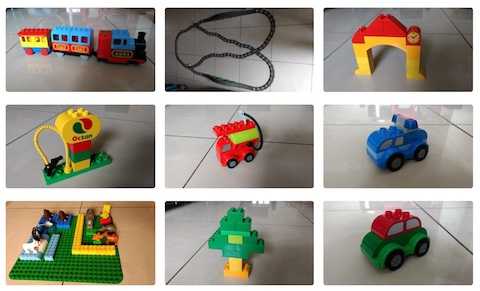
If you are building an image-rich webpage using Jekyll, you would know that images and Jekyll have a complicated relationship.
Markdown method
There is the Kramdown based method where you include an image like this:
{: .css-class}This is quick to use to include a single image, but restrictive since it doesn’t support captions or multiple images.
Liquid method
Or you could use Liquid to create a Jekyll include. For example, you include an image like this:
{% include image class="css-class" path="/assets/images/file_thumb.jpg" url="/assets/images/file_detailed.jpg" alt="Alt Text" caption="Caption Text" %}Then you need to provide a file called image in the _includes folder of your site’s root where you provide the logic to parse the include parameters and spit out html code. For example, it could look like this:
<figure class="{{ include.class | default: "" }}">
   <a href="{{ include.url }}">
      <img src="{{ include.path }}" alt="{{ include.alt | default: "" }}">
   </a>
   {% if include.caption %}<figcaption>{{ include.caption }}</figcaption>{% endif %}
</figure>
Image Grids
But this is still just one image. Thankfully, the Minimal Mistakes theme I am using, came with a gallery include, which works as explained here. You can check out the source code here. Using gallery you can create nice looking image grids that look like this.
This works really well, provided you are only using images that are all of the same aspect ratio. The gallery include works by basically setting the image width to 33% (minus some padding), so you get three images in each row. But when the images are not of the same aspect ratio, then the images end up not being of equal height. This looks really weird!
Flexible Image Grids
It proved a bit hard to find a solution. But with the right search keywords, I came across this solution which uses the Flexbox layout style. Using the same idea, I wrote a flexgallery include which I could use to height-align the above grid. You can check the source code here. But here is a prototype version of flexgallery:
<figure>
  <div style="display:flex">
  {% for img in flexgallery %}
    <div style="flex:{{ img.aspect }}">
      <a href="{{ img.url }}">
        <img src="{{ img.path }}" alt="{{ img.alt }}">
      </a>
    </div>
  {% endfor %}
  </div>
  <figcaption>{{ include.caption }}</figcaption>
</figure>
The display:flex in the container div gets the images to sit side-by-side. The flex:img.aspect in the inner div’s restricts their aspect ratios to tightly wrap the images while maintaining the same height. And this was the result on using it!
That concludes how I got images to work in Jekyll, starting from inline images, hyperlinked images with captions, to symmetric image grids and finally equal height grids for images with unequal aspect ratios!


